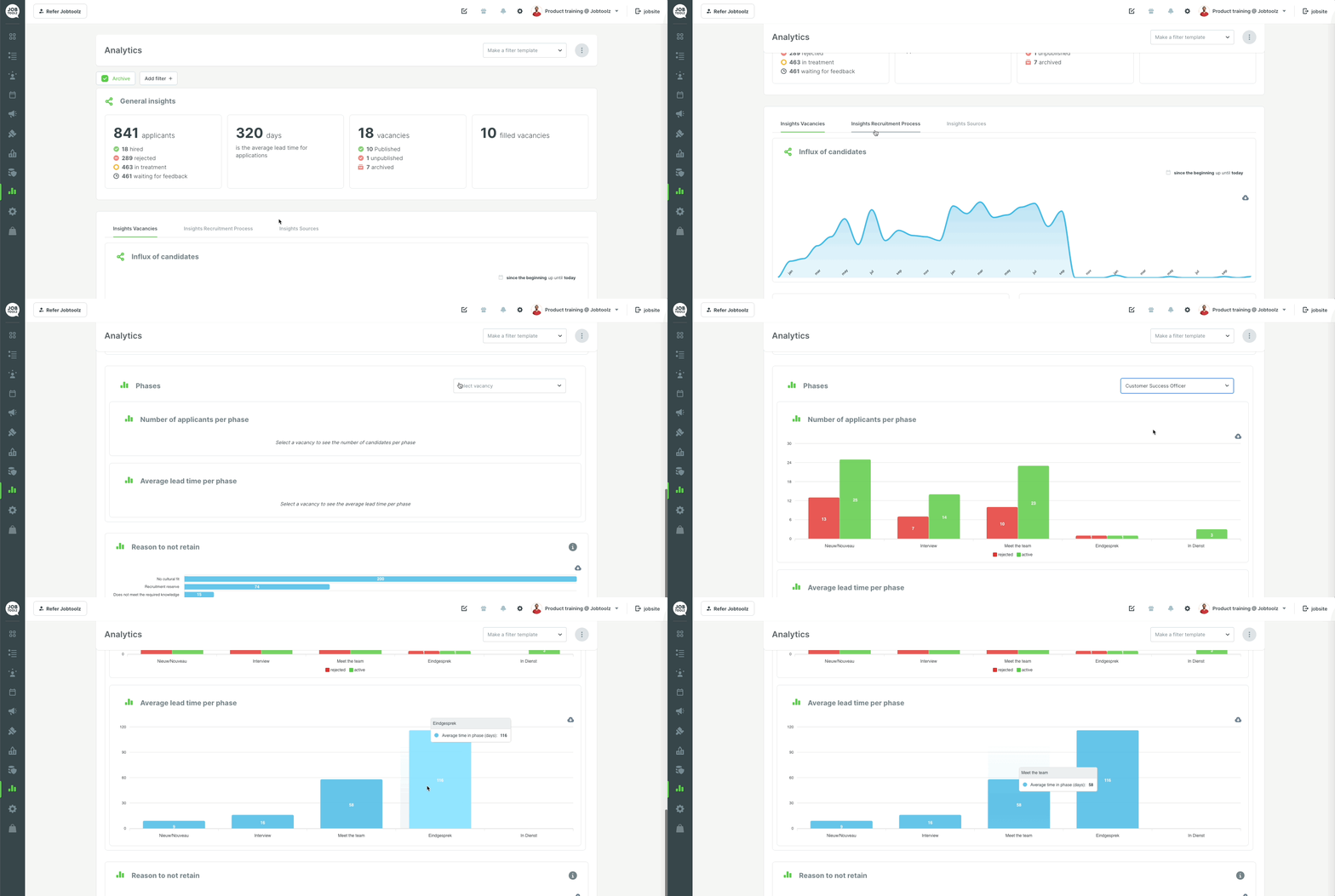
Where can I see the average lead time for my candidates per phase?
This article explains the graph tracking the average lead time of candidates in each phase.
In the ‘Analytics’ module, go to the ‘Insights Hiring pipeline’ tab to see the ‘Average lead time per phase’ graph.
This graph shows you the average lead time for each candidate per phase. In other words, it tells you how long a candidate remains in each phase on average before being transferred to a new phase. To view this graph, first click the button on the top right, ‘Select vacancy’ and choose the vacancy you’re interested in.
You can also download the image as a SVG, PNG or CSV file and paste it directly into your own reports. To do this, click on the grey cloud next to the graph.
