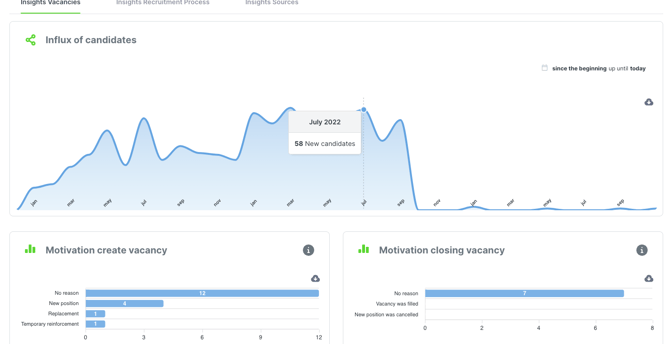
In the ‘Analytics’ module, click on the ‘Insights Vacancies’ tab to see the ‘Influx of candidates’ graph.
This graph shows how many candidates applied at each date from when you started using Jobtoolz to the present. Hover the mouse over the graph to see the exact figures for each date.
You can also download the graph as an SVG, PNG or CSV file and paste it directly into your own reports. To do this, click on the grey cloud next to the graph.