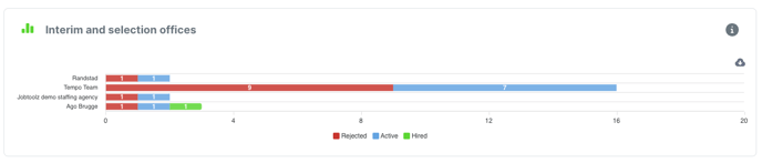
In the ‘Analytics’ module, go to the ‘Insights Sources’ tab to see the graph for ‘Interim and selection offices’.
This graph shows the candidate flow from each linked interim or selection office. It also shows the breakdown into rejected candidates, hired candidates, and candidates that are still being processed. You can therefore see easily what the quality of candidates coming via each office is.
You can also download the image as a SVG, PNG or CSV file and paste it directly into your own reports. To do this, click on the grey cloud next to the graph.