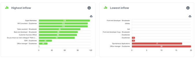
In the ‘Analytics’ module, go to the ‘Insights Vacancies’ tab to see the graphs for ‘Highest influx’ and ‘Lowest influx’.
These graphs show the vacancies with the highest and lowest rates of applicants.
You can download the graph as an SVG, PNG or CSV file and paste it directly into your own reports.
To do this, click on the grey cloud next to the graph.